Monday, May 7, 2012

WEEK12: The final Comps


Finishing everything up with in Degree Project has been an eye awaking experience. This entire process was a lot of fun, stressful, long and I really learned a lot. A lot, about myself, graphic design, and he way I work. This project started out as an exercise to improve my form, as well as to work with content I was specifically interested in.

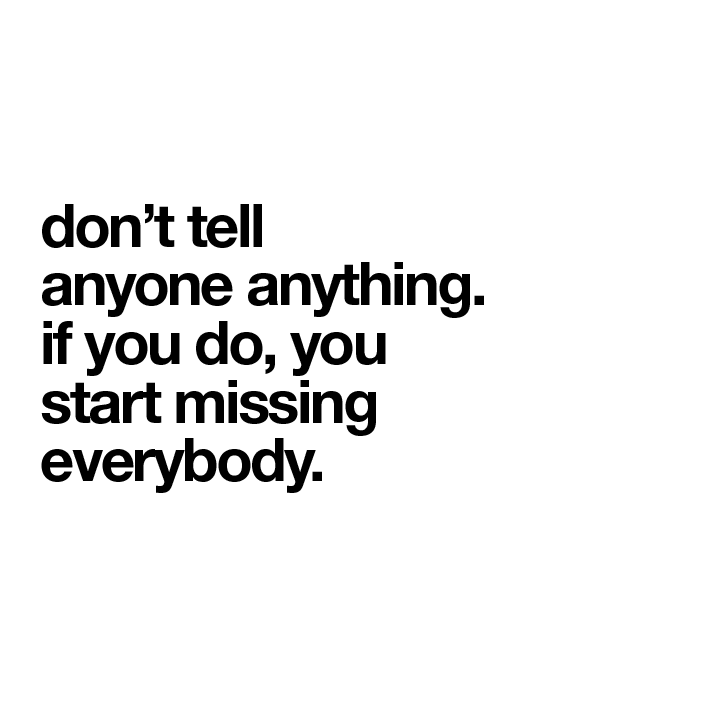
The Catcher In The Rye by J.D. Salinger was one of my favorite books in high school. I related to it. The angst and the confusion were the main themes I connected to. I decided to make compositions pertaining to 7 different quotes that stood out to me as I re-read the story. This went through a lot of process. I started with a narrowed down of 20 quotes, then moved on to 10, then 8, then for the final 7. Each quote was cut up and fragmented through out each composition to provoke a certain hierarchy and emotional connection to the content of the quote. Each comp was photographed, then collaged together to bring certain elements more attention than others.

What I want people to feel when they approach my project (which will ultimately be an installation) I want them to feel remorse, sadness, and somewhat of a regretful feeling. All the quotes I chose were in someway personal to me and my past relationships with friends, my family and boyfriends, but I felt that others could relate to them, and see themselves in these quotes. Although, when it comes to imagery...they deal changes a bit. Some are dark, some are bright and happy, but the content that is involved is always somewhat forlorn. So to me, this irony is powerful, and unexpected and I hope that my audience gets my play with imagery, especially pertaining to all the metaphors involved.
Taylor CTR Final


WEEK 11: Moving forward

As time has progressed I have made a lot of attempts at more quotes for my idea of the home installation. Here are some Images dealing with the two quotes of "Women Kill me. They really do", "Goddam Money. It always ends up making you blue as hell", the "Girls with their legs...." quote, and finally, "When you take a girl when she really gets passionate, she just hasn't any brains."


Above are initial iterations for those quotes. For the steak, I'm still running with the idea of people being a piece of meat when talking about the quote, "women kill me. they really do." Like I've said before, I think this quote could go either way when involved gender, but I decided to keep it the same to stay true to the book. But, I wanted this to have a place setting idea. To make all other elements look perfect, except for the steak being uncooked, raw, and dead. 

The pasta is representing of a girls brain. Or at least the women that Holden Caulfield refer to in this quote. Representing the similar idea of it being on a plate, like the steak insinuates that someone is about to eat it, or in the process of eating it. 

And finally, the girl with a crown, and the girl with no crown. This one is more representing of status, respect, and money. More than just money. I wanted to show the same girl (me) as looking on both sides of things, and neither being happy. It's more of an interpretation on this quote, but also the idea of the grass is never greener on the other side. 

After showing these ideas to my professor and some classmates I had some good reactions, but I also moved forward with other ideas as well. Here is an example of how I pushed the noodle idea further.


As you see here, is the set up I had for my composition. I decided to give the noodles an actual context, rather than having the audience interpret the idea from a dinner plate. Placing the messy spaghetti on a pillow I think puts it in an odd place so it's kind of eye-catching, and the audience wants to investigate more.

Sunday, May 6, 2012

WEEK 10:Starting with a new aesthetic.

Throughout the process I have been dealing with imagery I felt that anyone could relate to. I wasn't creating what I wanted with my own, hands. Except for in photoshop. So starting here I discovered that going back to my roots of making images with my hands and then photographing them seemed to be a lot more successful. I wanted to get my largest and most eye-catching piece out of the way...mostly because I knew that the space allotted for me would be difficult to deal with. This is due to my inexperience in making "poster" work. So the traditional size of 24"x36" has always frightened me a little bit. Here are some interations I dealt with while working with the quote, "When I leave a place, I like to know it. If you don't, you feel even worse". 


Here I'm trying to work with the traditional idea of the "Home, Sweet, Home" idea that one would see in their mother's or grandmother's house above a door, or kitchen stove. The imagery is somewhat bright/positive, but the quote is melancholy and depressing. I feel that I am on to something here, within the way I'm using pattern and the idea of collage. Collage has been an aspect that I had been using before, but adding a different density of a background changes up the over aesthetic of the composition.

After going through these composition iterations it was then brought to my attention that I should start using more personal imagery, and stop searching the internet for the perfect house, or any object I may need in these compositions. I know that I learned this lesson as a sophomore, but being on the computer all day and most every nights, it's really hard to not use google images and pull files off of it. After conversations with my professor and classmates I realize that the door to Mineral Hall the Kansas City Art Institute would be perfect for this. Not only does is it one beautiful entry door, but it's a symbol of KCAI, which I've grown to love a lot for what it's done for me.

Here is the final image for this quote I decided on:


You may notice that it is placed in it's frame as well. I needed to start placing these in their actual frames I was going to use in order to start seeing the real picture of what I wanted to accomplish. The text of this comp. is the actual book text cut out of the book. I decided to do this because, as you saw above, there was some problem with come up with using the appropriate type treatment. I then thought about what I was doing, and trying to convey. I thought, "Why not just use the actual quote from the book?" So, thus I tried it out, and played with how the treatment to the actual page would turn out. After this was done, it was the way my system was to exist from here on out.

Friday, April 6, 2012

WEEK 9:Collection of Frames

After figuring out that I wanted to present my comps in frames I went on a hunt for unique, homey, and ornate frames. I knew that with my grandfather moving out of his house there would be an abundunce of metal older frames that I could possibly use. I then went around to local thrift stores to see what I could find there as well. Now I'm the girl with all the frames....Here are my final picks to use in my installation:

I definitely wanted size and texture to vary through out the entire composition of the installation, so I chose frames from metal, to wood, to possibly painting them to pop more...

I played with compositions of the installation after I realized how many frames I would end up having which is 14 from large to small.


 This was an exercise to visually see what I could possibly make out of these frames, and what ideas I want to express. I have to think about hierarchy...and the story that is behind these comps. What do I want people to feel like when they come upon this installation? What eye-catching element will tie them into the entire composition? And Will they even stick around to see all elements?

To answer the first question of "When do I want people to feel like when they come upon this installation?" Well, the quotes I pulled from the Catcher in the Rye they aren't exactly uplifting. They are more resembling disappointment in what happens in the world. So, I want people to feel sad, reflective, and possibly nostalgic. Taking them back to a time where they could have possible felt a similar way to the quote being expressed.
 To the next questions about it being eye-catching and it telling a story. Well, I have really thought about all seven quotes that I'm using and I have numbered them by importance and to make it more of a linear story. Here the order is:

1. "When I leave a place I like to know I'm leaving it. If you don't, you feel even worse."

2. "Women kill me. They really do."

3. "Don't tell anyone anything, if you do you start missing everybody." 

4. "You take a girl when she really gets passionate, she just hasn't any brains" 

5. "Goddam money. Always make you blue as hell." 

6. "Girls with terrific legs, girls with lousy legs, girls that looked like swell girls, girls that looked like they'd be bitches if you knew them." 

7. "Dopey guys. Guys that are very mean. Guys that never read books. Guys that are very boring." 


While I was organizing these into a list I started to identify themes that I have earlier talked about that has to deal with this book in it's entirety. I identified specific themes with each quote they are: Relationships, Sex, Depression, Superficial, Vulnerability, Innocence, Saying goodbye, Regret, and Alienation. I imagine these words to be placed through the composition of installations as well, but much smaller and more subdued. I feel that this is where my more handmade touch will come more into play...I'm planning on experimenting with different rendering methods. Such as: embroidery, knitting, digital type, hand drawn type, or collaged type. 

WEEK 9:A change of pace


Moving forward from mid-term critique there was a lot to think about, and a lot of questions to answer. The main ones being: Who am I designing this for? Which I have addressed previously, but I have targeted it even more, so that it would help my design process move along faster. My audience for my degree project is directed towards people who collect. Collect objects, memories, words, books, etc. This lead me to an idea of how then are these comps going to be presented. Are they just going to be prints on a wall?…Are they going to be displayed together, or separately? 

 So, moving forward the idea of my comps being framed  I let made it seem more precious, and more personal. This also determines the size of my work, which I was having trouble with. The sizes will vary from 24x36 to 4x6.

Here are some images of inspiration of how i may end up framing my work. There are some things to address though: Will this get to kitschy? Will it become a more "hand-made" piece than a graphic design concept? (I'm hoping these two questions will be no to both.
I intend to place other objects/words within the installation as well. Possibly a clock, or mirror to show how time is reflective, and also to remind people that you don't have forever.

Sunday, March 4, 2012

WEEK 7: This is supposed to be ironic.


I mostly did these exercises to be ironic. But, as I was doing them, I did realize how much harder this trend is to actually execute. I'm not even sure I did this successfully, but that's not really the point. As I was setting this type I was thinking about how I could compare my final designs to these comps of just the quotes set in helvetica bold. It could be interesting to see what people would relate to or be more interested in.